1

I've always had mixed feelings about this tongue
Over the years I got used to Kinovea not having a main toolbar… but well, I guess they are popular for a reason.

This will probably be tested in next experimental version, don't hesitate to speak your mind whatever you think.
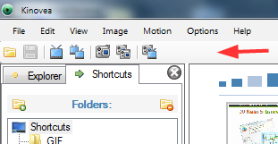
http://www.kinovea.org/screencaps/0.8.x/toolbar.png

2

I do understand the benefits of a toolbar. It would make learning about the program for beginners more intuitive (also less mouse clicking).

However, my main concern with a toolbar is that it would decrease the size of the viewing area. Maybe one could choose whether to have a toolbar, similar to the file explorer sidebar.

3

As long as the toolbar can be repositioned (e.g. put at side of screen) it should not reduce the image size, well not on widescreens at least.

4

Would it be possible to aim to remove the classical menu with a toolbar/tabbed toolbar/basic ribbon?  This is the approach being adapted in Windows 7 as part of the UI update and being encouraged to programmers now.