1

(this is for mid-term evolution, please add your thoughts to the discussion smile)

I am not entirely satisfied with the existing set of drawing tools. Some important tools are missing, others could be improved in their functionality and usability.
I've been thinking for a while about what to do about it, with the goal of having the most comprehensive and useful set of tools possible. On the other hand, the interface must stay as simple as possible.

I like to think of drawing tools in two categories : tools to observe and tools to show. I also call them, respectively analysis tools and telestrator tools.
(Telestrators are devices used in TV broadcasts of team sports, to explain tactics to the audience)
Typically an arrow or a circle are tools to show the viewer where to look or what to look for. These are tools used during a debriefing, when creating a video explanation, or similar "teaching" actions.
The observation tools (measuring a line, checking an angle, stopwatch, etc.) are tools that would be used during the actual analysis of the performance.

Here are some of the intended changes :

Organisation
- Better organization of the tools on the toolbar to reflect the tool usage (just sorting them differently).
- Separation of the arrow tool from the line tool. Lines and arrows serve different purpose, the fact that they are implemented by the same underlying code shouldn't be reflected on the interface.

Possible new tools
1 - Spotlight : a tool that would dim the entire image except its own area.
2 - Rotation arrow : a tool to symbolize rotative motion.
3 - Auto numbering mark : a number inside a circle. Each time you add one, the number increments.
4 - Simple rectangle.
5 - Multi line - Should also support measure on each segment and/or angle value at each joint.

Improvements to existing tools
- Circle changed into ellipse ?

Considering the number of tools and the limited place some grouping of tools might be needed.

Mockups for some of the proposed new tools
(spotlight, rotation, auto-numbering)
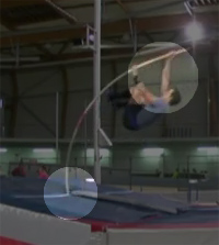
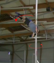
http://www.kinovea.org/screencaps/mockups/tool-spotlight.jpghttp://www.kinovea.org/screencaps/mockups/tool-rotation.jpghttp://www.kinovea.org/screencaps/mockups/tool-autonb.jpg

Comments, ideas for new tools are much welcomed, as well as improvements suggestions on the functionality and usability of existing tools.

2

hello Joan,
very great news tool , hope you will insere them soon in the next version alos can you add the clock tool, a circle with hours on it , also a multidots graphics
thanks
Yves

3

Hello,

These new drawing tools look awesome!

While I was seeing the spotlight effect an idea came to mind.
Shoot me if it's a bad one.

Would it be possible / interresting to link the spotlight feature with the tracking feature.
Exemple, you could highlight the hands on a golf swing on every frame and it would automaticaly track the hands by doing a curved line.

The tracking feature would track what is in the center of the spotlight circle.

What do you think?

Laters

Daww

4

Thanks

yvesrpt wrote:

the clock tool, a circle with hours on it

This sounds like this could be implemented as an observational reference.
This reminds me that I wanted to craft some more "protractor" like tools there. (And possibly remove the few anatomy reference for now as they don't seem so useful as they stand).

yvesrpt wrote:

also a multidots graphics

Can you expand a bit? I'm not sure I see what you mean.

daww wrote:

link the spotlight feature with the tracking feature

Yes, it would definitely be interesting to have that. I think similar idea has been suggested with the magnifier tool as well.
Maybe you would add a spotlight, and simply right-click it and choose a "Track this area" menu.
It would have to work slightly differently than the existing track tool though to simplify the usage.

5

Hi Joan

for the clock, her eis the link from sport cad, a video analsyis siftwar , there a pict of the clok on it

for the multipoint dots , i mean  be abble to draw multi point in a row with a dot every time yu stop like this yu can put a dot on every joint of the body in one row , ? do yu see what i mean ?

thanks again for your GREAT WORK
Yves

6

http://www.sportscad.com/Analysis-Basics.html

oops miss the link  lol

7 (edited by Alexander 2011-03-28 08:38:05)

How about three functions under the "TRACKING":  Track area (The high light looks GREAT!), Track point, Track magnification (the last one would be a combination of the area and magnification-tools. There would be stationary window on the video in which there is shown a magnified, tracked area OR point?

When selecting the TRACKING-tools, there could be a dual option for either "analysis" och "view". The analysis-options would then give specific data (speed, position, accelerations etc.) to be instantaneously viewed or exported and the view-options wouldgenerally improve and increase usability of the footage?

8

I suggest an eraser tool that can clear the whole screen would be useful. It could go on the bottom right hand side and clear any annotations, lines or arrows made by the user.

joan wrote:

Separation of the arrow tool from the line tool

What i would find useful is a 'pencil' tool with an arrow. That is, a free drawing line that would become an arrow as soon as the user released the mouse click. This may also address the curved arrow solution as the user can draw the desired curve.

Regarding the current circle tool. Would it be possible to customise the thickness of the circle? I'm finding the circle tool covering too much of the video tongue

All of the suggestions sound great. Keep up the good work!

9

@Alexander: yep, auto-tracking magnifier and auto-tracking spotlight sound appetizing. Loosing the target will have to be handled differently than in the current tracking tool though.
Regarding improving the general video, if you refer to some sort of deshaking feature, I think this needs a different type of tracking (a "dense" tracking to compute the whole image motion at once). I'll eventually create a separate thread for this. That would probably end up being implemented as a "Motion" menu.

jon wrote:

What i would find useful is a 'pencil' tool with an arrow.

Like drawing two big lines of the same thickness than the rest of the drawing ?

jon wrote:

Regarding the current circle tool. Would it be possible to customise the thickness of the circle?

You should be able to do this by changing the "size" parameter in context menu dialog or color profile window.

10 (edited by jon 2011-04-01 01:32:00)

Thanks for the tip about circle tool. The next step is the ability to set the default thickness of the circle. From a user point of view, this would make it much easier in the long run, than to right click every circle that is made.

joan wrote:
jon wrote:

What i would find useful is a 'pencil' tool with an arrow.

Like drawing two big lines of the same thickness than the rest of the drawing ?

Right now we can only draw a straight line with the arrow tool. To draw a curved/free hand arrow, I was suggesting a pencil/free hand draw tool that had an arrow shape automatically inserted at the end.

http://i52.tinypic.com/314pjlw.jpg

Does this make sense? I understand you can probably do this anyway with the pencil tool already (draw the arrows at the end yourself). However, such a tool would make it easier to do live analysis especially when using Kinovea on a tablet device.

11

jon wrote:

The next step is the ability to set the default thickness of the circle.

You would do that with the color profile. (last button on the drawing toolbar). Alternatively, you can also right click before setting the drawing. This will set the color and size for the drawing type as a whole.

Thanks for the clarification about the freehand arrow.

12

In the analysis tools department, it has been noted that the stopwatch is functional but simple.

Maybe there could be a separate cadence tool (or tempo tool). Something to simply assess the frequency of a repetitive phase. Like strokes in swimming, strides in track and field, rotations in discus or hammer throw, etc.
The usability of this will have to be top notch to keep things simple. (The lap function on a physical stopwatch can be confusing at first, the tool would have to be simpler than that if possible).

13

I almost hate to suggest something because I dont want it to seem like I'm complaining when I love the software.  One thing I would like changed for my uses is the fade in and fade out time of the drawings.  I feel like they fade in and out too slow. 

Thanks for this program and for constantly improving on it.

Eric

14 (edited by joan 2011-04-07 00:05:00)

Oh yes, I had forgotten about that one.
The value should be in seconds also, instead of number of frames…

Suggestions are not viewed as complaints. Constructive criticism is always appreciated. And thanks for the heads up wink
I think I'll just bump it up to something like 200/300 frames, and switch to seconds in a later stage. (I'm actually using a modified version with exactly this change to create the example videos smile)

By the way, people have noted that the persistence concept and interface could be improved in terms of usability. If anyone has a solution that would be better than the current one, feel free to propose. I've had thoughts about a sort of manipulable curve that would symbolize the amount of opacity relative to time, but that would probably make things even more complicated.

15

Hi, I have been using Kinovea occassionally for clips of ruby matches exported from Longomatch. The 2 complement each other quite nicely.

I really like the idea of having the spotlight feature combined with tracking, this would be ideal for highlighting a specific player and show their good/bad techniques. This is the one feature I cannot seem to be able to find in any video editing software (besides the mega bucks versions) that is easily implemented.

Count me as a big supporter for this feature.