1 (edited by joan 2024-05-18 17:40:00)

Post history

  • 2023-08-30: First release of 2023.1

  • 2023-11-12: Updated with links to 2023.1.1

  • 2024-05-16: Updated with links to Machine vision plugins

  • 2024-05-18: Updated with links to 2024.1.2

----
Hi everyone!

This release packs some major features and a lot of quality of life improvements.

There is still a list of issues and limitations I wanted to address but haven't had time to, but I don't want to delay this any further.

Note: at this point the release is not signed. I'm hoping to resolve this situation as fast as possible. (This means you may have to work around Windows smart screen to install it).

Links

    Kinovea-2023.1.2.exe (installer)
    Kinovea-2023.1.2.zip (self contained archive)

Camera plugins

    Kinovea.Basler-1.3.0.zip (Pylon 6.1)
    Kinovea.Baumer-1.1.0.zip (GAPI SDK 2.11)
    Kinovea.Daheng-1.1.0.zip (Daheng Imaging SDK 1.14)
    Kinovea.IDS-1.2.0.zip (IDS software suite 4.96, only compatible with uEye UI-xxx cameras, not the newer U3-xxx cameras).

In parenthesis the version of the vendor SDK or runtime against which it was built.
It may work on newer versions but if you have an issue try to get back to that specific version for compatibility purposes.
----

Here are some of the main updates (I know I probably say this at each important release but I intend to make a series of videos going into more details).

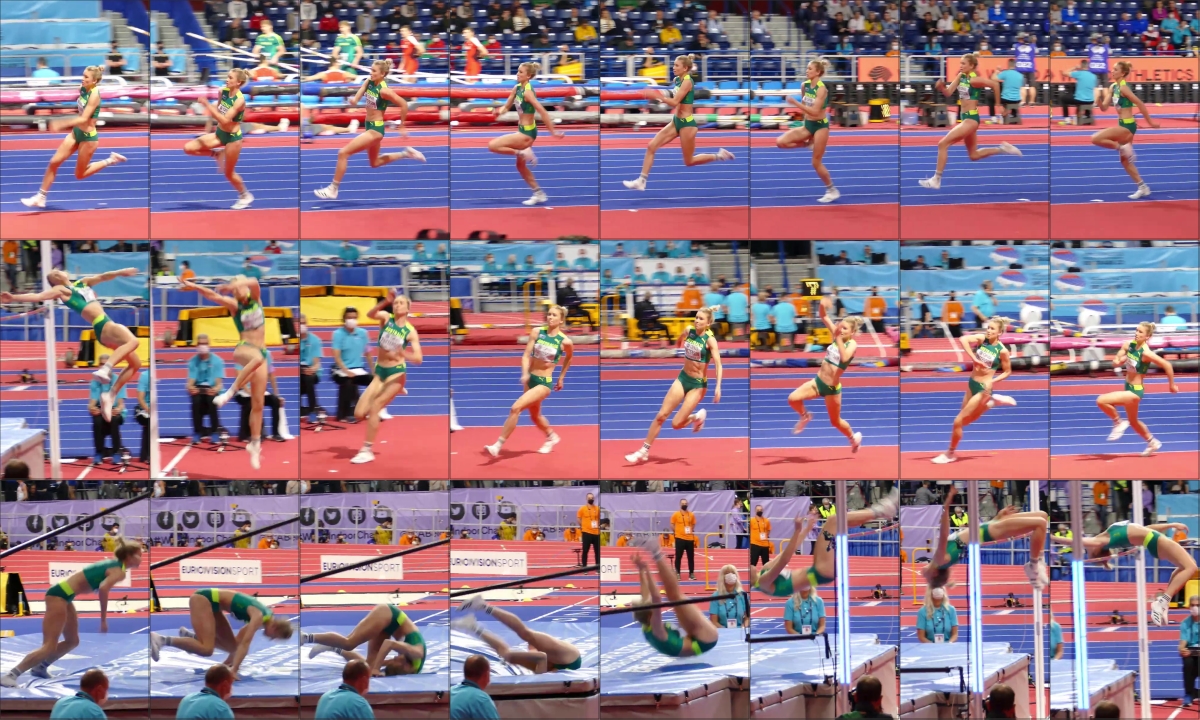
Kinogram mode

Interactive Kinogram creation, my favorite feature.
https://www.kinovea.org/screencaps/2023.1/2023.1-demo-kinogram.jpg

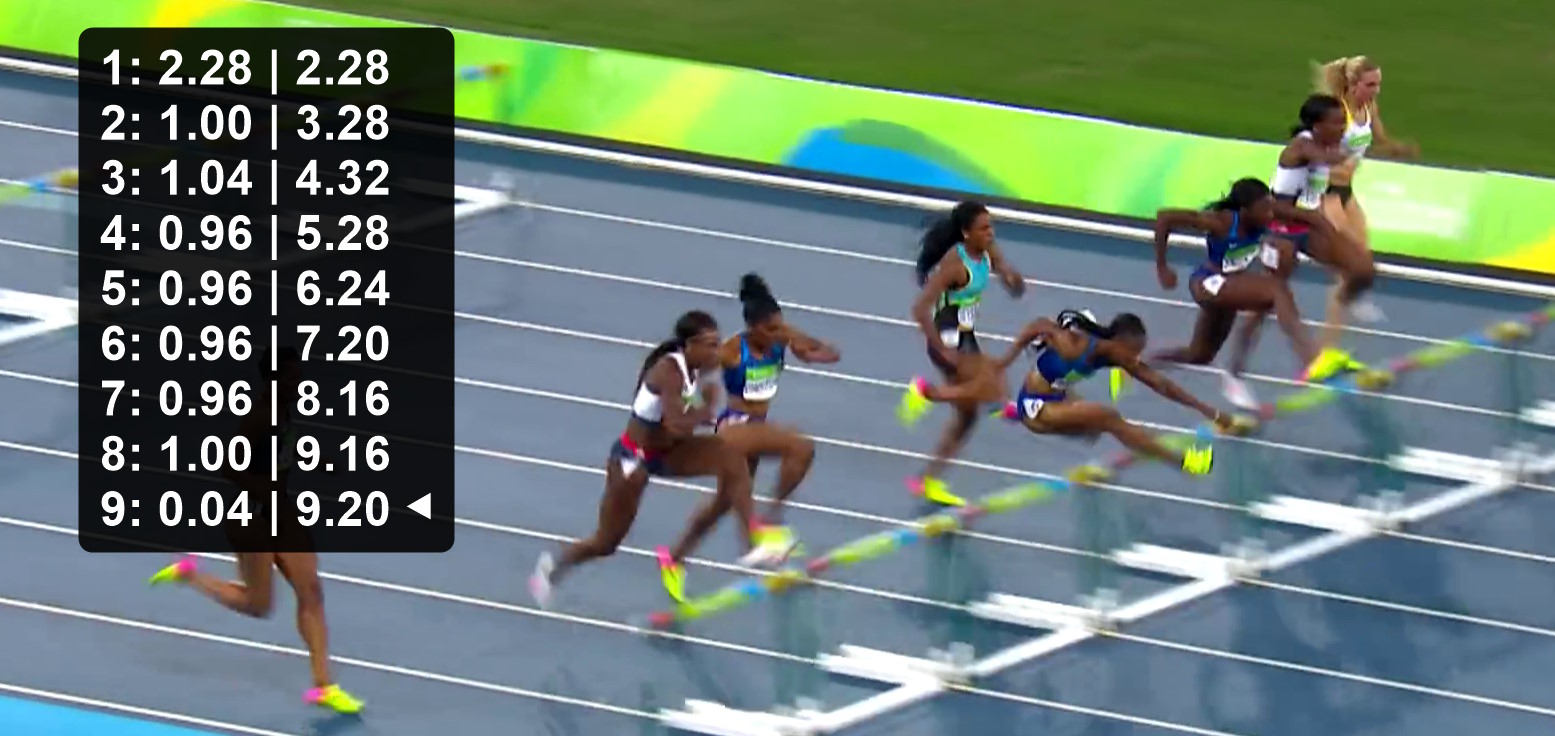
Multi-time chronometer

Each chronometer has multiple time sections and can show the cumulative time. Use this for split times or related measurements within the same video.
https://www.kinovea.org/screencaps/2023.1/2023.1-chronometer.jpg

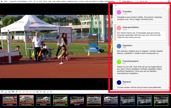
Key images management

Each key image has its own color. There is a collection of "presets" that let you insert a key image with a custom name and color via a keyboard shortcut.

The key images can be reorganized and moved in time by dragging them onto the main timeline.

The comments have moved to a side panel.
https://www.kinovea.org/screencaps/2023.1/2023.1-demo-sidepanel.jpg

Spreadsheet export

For scientists and researchers: the spreadsheet export was completely re-written to be more exhaustive and target more modern versions of Calc and Excel. There is also a new JSON export in case you want to parse the data into your own programs and some tool-specific CSV exporters.
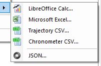
https://www.kinovea.org/screencaps/2023.1/2023.1-demo-spreadsheet-export.jpg

Document export

For coaches creating reports: it is now possible to export a document with the key images and the  attached comments, to prepare a report. The default format is Markdown but by  installing Pandoc (open source software) and telling Kinovea where it is  installed you can export to .docx or .odt. The export is kept simple on purpose so you can tweak the formatting and style in the  target application before creating your PDF.
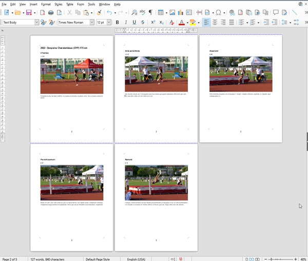
https://www.kinovea.org/screencaps/2023.1/2023.1-demo-export-document.jpg

 
Quality of life improvements

  • Save vertically stacked videos and images.

  • Sort files by name, date or size in the explorer.

  • Support for undo/redo of drawing manipulation.

  • The drawings are rendered in the magnifier area.

  • The coordinate system can be added in Capture.

  • A new status bar in Capture indicates the state of recording.

There is more, including new experimental tools and changes I haven't mentioned, but I will leave this for later.

If you read until here, thanks for the support!

2

Here is a list of the limitations and things I'm most likely to look at next

- In Kinogram mode, being able to change the time of each individual image, and change the font size of the labels.
- Counter and cadence tool.
- Camera motion compensation and related features.
- A way to export videos with more reasonable encoding parameters, for social media and whatnot.
- A number of videos people have shared end up cut short at the end for some reason.

Some of the machine vision camera plugins may not work with this version, I'll go over them as soon as I can.

Note: the translation coverage fell behind when I integrated the strings for the new features, you can help here:

https://hosted.weblate.org/projects/kinovea/#languages

3

An excellent upgrade Joan. Thank you for your continued efforts towards improving this already powerful software. Wish you had a Mac version. ;-)

4

Here is what I intend to do with releases going forward. After this initial release I will make several branches. We will consolidate bug fixes and translation updates into 2023.1 (calling it 2023.1.1, 2023.1.2, etc.), while new features and improvements go in the next version as normal. Basically the main change compared to before is that we will keep this version alive and it will receive bug fixes and language updates for a while.

5

Wow Joan,
thanks for the new version. The new features are great. I think it's great that the drawings are now displayed in the magnifying glass and that the stopwatch can display and export intermediate times.
I recorded videos with our USB-to-HDMI (Razor Ripsaw) stick and the selected frame rate was the same as the recorded videos. Thank you for that!

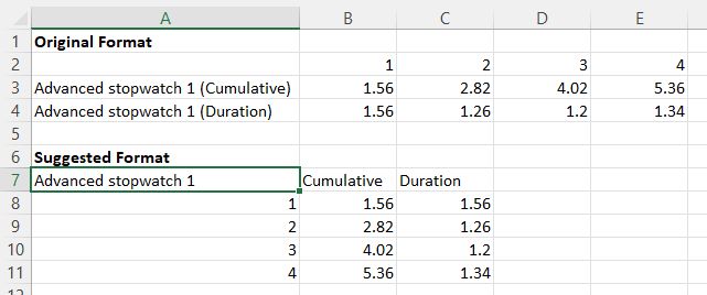
I have a suggestion for exporting the stopwatch: it would be better to export the table transposed so that the intermediate times are in the lines. This would make importing with a lib like csvhelper easier. Maybe "Nr" is not a good name for the heading.

https://i.postimg.cc/rsBjTPwY/stopwatch.jpg

Many greetings,
Christian

6

Thanks.

There are two ways to export the stopwatch data now. The traditional way using Calc or Excel as a target and the dedicated Chronometer CSV export.

The traditional way should export the data as in your suggested format. Each stopwatch will have its own separate small table with the split times and cumulative times, and also start and stop.

Now the second way is more advanced, and the reason it's organized like this is because it will try to match different time sections from multiple stopwatches, by their names (I have a video coming up explaining the new options more in detail).

This is interesting when you have several of these multi-time stopwatches overlapping. To give an idea, the first use-case this was developed for is a hurdle race where you are timing both the time intervals between the hurdles and the jump time above the hurdles, and then you want to export a table where you collate all the data for each interval. So you have a column for say the 4th interval and then you have rows for all the things you have timed during this interval.

I guess it could still be transposed, but I know at least one user that is really interested in having it in this shape, so it would have to be an option like a checkbox on a dialog before the final export.

A third way to export is through the JSON export, in this case the data is a bit more structured and it could be shaped differently, this is intended for consumption by another programming language.

7

ok I understand. I just tried exporting multiple stopwatches and see what you mean.

We have previously done this type of hurdle analysis in Dartfish and have exported a table with the split times for each athlete. So the take-off before the hurdle is in the even rows and the landing after the hurdle in the odd rows. We then read the individual tables into our database, so we don't need the times of all athletes to be in one file.

It would be very nice if the active stopwatch had a color border and the shortcuts F5 and F6 only applied to the active stopwatch. That would speed up the analysis a lot. I noticed that it goes faster if you analyze the athletes one after the other and not hurdle by hurdle.

One less feature that Dartfish is ahead of Kinovea :-) And the json export is also great for reading the data into our database and doesn't exists in Dartfish.

8 (edited by joan 2023-09-20 14:53:02)

Right now the way to prevent the shortcuts to be applied to a particular stopwatch is to use the menu Options > Locked on that stopwatch. It's the only thing this menu does (you can still start/stop/split manually). I admit it's still not perfect though, it has already happened to me a few times to forget to set it and mess up the times. If you show the label above the stopwatch, it also has a little square icon which represent the "locked" state.

edit: Maybe another idea would be to check if the stopwatch already has data points in the future and in that case ignore the shortcuts. I think in most cases it should be the right thing to do. If we really want to accept shortcuts in the middle of the existing times maybe *this* can be the explicit option to activate. The only issue with this approach is that it will still potentially add unwanted time points at the end.

9

OK, thanks for the explanation. I just tried it out and think it works quite well. It would be nice if the label was displayed on new stopwatches after the label was switched on on the first stopwatch. Just like it is with the crossmarks. Then I think an analysis with 3-5 athletes per run can be done quickly without spending a lot of time in the (sub)menus.

Regarding your edit: I think it's getting too complicated and there are still some corner cases where it doesn't work.

Another idea would be to introduce a menuitem "set active" (?) so that all other stopwatches are locked. That would be very clear from the user's perspective. The opacity of the locked stopwatches could then be decreased by 20%.

10

I like this idea. And there is a related UX issue with trajectories, when there are several of them crossing paths it can be difficult to manipulate one without inadvertently grabbing a point from another, and this could use a similar approach of "disable all the others and make this one special". 

I wish to make the menu phrasing more explicit though, maybe something like "Disable shortcuts for other stopwatches" or something along these lines.

11

Regarding the label, I've been wondering if this should be extended to all options in all tools. Like if you change the color of a line the next created line starts with this color. And then hide the whole color profile thing. I also want to have the style options of the current object directly available in the new right-side panel at some point.

12

Hey Joan, 10000 thank yous for the update. Lots of much needed features added and seems to be a slicker package already minus a few small issues.

One bigger issue I have been having is extremely slow video exporting. Especially composite videos. What used to take 30 secs, is now sometimes taking 10 minutes +.

Please let me know if this is an issue you have come across with others or if it is maybe my poor hardware?

13

I haven't come across this issue. The video export was rewritten and maybe this is what introduced it. One major change is that the video is now exported at the original image size, where it was exported at the display size before. So for large image size this may make the export longer.

I still want to have a system to choose different export formats for web vs archiving as soon as possible but it's a bit of a big undertaking.

14

I've done some further investigation. Seems that all my videos are very slow to export, regardless of base file size/resolution etc... I also now seem to have the issue of the comparison videos exporting "zoomed in" and then not playing, regardless of format (AVI, MP4). Screenshots attahced for reference.

I'll try a re-install of 2023.1. Should I also uninstall 0.9.5? As I have both on my computer at the moment?

Thanks as always for the help

https://1drv.ms/i/s!AoF0dvPSkznVgfxxlJkdCKdps33ItA?e=Zf3Xfg

https://1drv.ms/i/s!AoF0dvPSkznVgfxwxBXBa5e-uT_0uw?e=3B3OVD

15

If you want to use both versions at the same time at least one of them should be the "portable" version provided as a zip file. Otherwise they will share the preferences folder and since the format has changed this will cause issues. But I don't think this could cause this kind of issues.

Could you share one of these vertical 4K videos with me? Are they opening in portrait automatically or did you explicitly use the rotation menu? In the second photo are they really zoomed-in or is it just how they would look at 1:1 scale on your screen? (what's the resolution of your screen?)